
Rapid Rescue. The easiest way to learn CPR.
Rapid Rescue is a mock app designed to make learning CPR straightforward and accessible for everyone. Rapid Rescue offers comprehensive CPR tutorials, essential general information on CPR techniques, engaging quizzes to test your knowledge, and local resources and news. Whether you’re a novice or looking to refresh your skills, Rapid Rescue ensures you’re prepared for any emergency situation.
Date January – February 2025
Project type UX Design
Location Online
Challenge Users are looking for a simple and accessible way to learn CPR across all platforms, whether they’re on the move or relaxing at home. They want the convenience to learn CPR skills anytime, anywhere.
Goal To give people a simple, customised and intuitive way to learn CPR.
My role This is an individual project that allowed me to plan and direct each step of the design thinking process as a UX design student with mobile and responsible web UI design experience.
My responsabilties Conduct user research. Define the problem and provided insights to inform the ideation phase. Define personas, user journeys, empathy maps and user flows. Visual design of low-fi and high-fi wireframes, prototypes, and user testing.
Research
Key challenges & constraints
The biggest hurdles I faced was juggling both time and budget constraints. Since this is a solo project for a mock app, meeting deadlines while keeping it a €0 budget proved to be quite the challenge. It required a lot of careful planning and resourcefulness to make it all come together.
User research personas
To identify better what users would want, I surveyed potential users and discovered the following points. From my results, I identified key insights and categorized them into three main areas: app features, challenges, and knowledge.

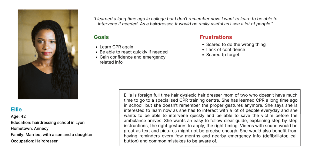
After organizing my findings, I developed my user persona, Ellie:
Throughout every phase of the design process, there were several key aspects I consistently focused on to ensure a seamless and user-centered experience.
Ellie is a full-time hairdresser who interacts with a lot of people daily, I want to be able to quickly learn CPR and be reminded of the gestures regularly so that I don’t forget the best practices and be able to help if needed.
Ellie is a busy full time employee who needs an easy app/website experience to quicky learn CPR and have refreshers as she has a lot of customers.
If Ellie uses Rapid Rescue, then she can view the tutorial multiple times and set reminders to be able to have refreshers every once in a while.
The app will let users watch easy to follow videos/read a step-by-step CPR guide which will affect how many users fully learn how to give CPR in case an emergency happens in real life. We will measure effectiveness by analysing how many users set alarms/reminders for refreshers.
Competition
To evaluate the user experience of each competitor’s website, I conducted a competitive audit. My research revealed that there are limited apps offering medical training. Initially, I found mostly in-person training programs or a lot of apps that only monitor your heartbeat. However, deeper research led me to discover apps designed for professionals or medical students, such as CQPR and Full Code Medical Simulation. I also identified apps that are more oriented towards civilians, like First Aid – IFRC and Le Bon Samaritain’s Staying Alive.
CQPR provides products and programs for healthcare providers, voluntary organizations, educational institutions, hospitals, and the military worldwide. Using CQPR require mannequins indicating that it may moslty used in training centres.
Staying Alive helps the general public to learn the correct emergency gestures. It offers an option to become a member and is focused on teaching life-saving skills.
Full Code Medical Simulation is designed by medical practitioners for medical staff. This intuitive, mobile-first medical simulation app offers over 200 realistic medical simulations with virtual patients and an engaging, gamified interface.
First Aid – IFRC offer users the option to build their own emergency kit and learn common best practices. It is oriented towards civilians and offers the option to become a member.
From this research, I identified the following strengths and weaknesses among my competitors:
| Strengths: Extensive knowledge and expertise Interactive quizzes and flashcards for learning High-quality educational content | Weaknesses: Limited accessibility and language availability Requirement for external tools (e.g., mannequins) Some features are non-functional or buggy |
| Opportunities: Offering translations in multiple languages Including illustrative drawings Making more features available for free | Gaps: A scarcity of apps tailored specifically for civilian use |
This comprehensive analysis helped me identify areas where my app can excel and differentiate itself in the market. By addressing the gaps and leveraging the opportunities, I aim to create a more accessible and user-friendly medical training app for civilians.
Design
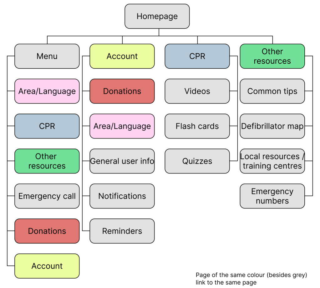
Sitemap
After completing my research, I transitioned to the design phase and focused on creating the sitemap.
First drawings
I then began sketching the initial layouts for all the app’s pages, including the homepage, tutorial, quizzes, account page, and resource section.
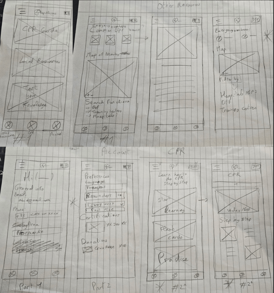
Once I finished sketching my wireframes, I transitioned to Figma to create digital low-fidelity wireframes for all the app’s pages.
Main user flow:
Other pages:
User study
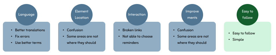
I then conducted an unmoderated user study, allowing users to independently test the app and provide feedback on its functionality. Through this study, I discovered areas that needed improvement, such as the choice of language (English or French), interactions, and the placement of certain elements.
Users liked the user flow in general, and found the app easy to easy and simple.
Switching to high-fidelity prototypes
After wrapping up my initial user study and documenting the areas for improvement, I moved on to designing my high-fidelity mockups and developing the final prototype.
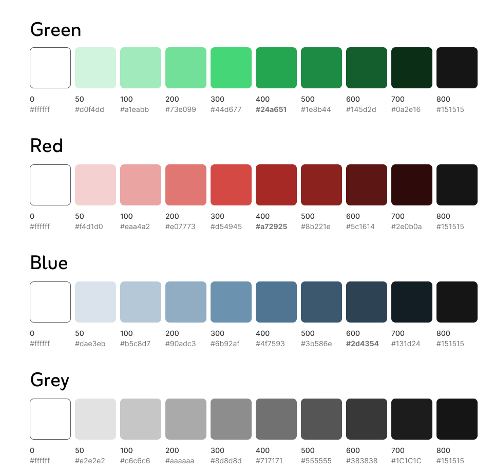
Colours
Since this is a mock project, I had the freedom, and challenge, to select my own color scheme. I chose to go with shades of blue and red as the primary colors.
Blue is often associated with trust and reliability. Blue also instills a sense of security and reliability. Red, on the other hand, signifies urgency and action, making it a perfect dynamic and engaging element to the design, capturing users’ attention and encouraging active participation.
I ensured that the chosen shades of blue and red provided sufficient contrast for readability and usability. This consideration is especially important for users with visual impairments, ensuring that the app is accessible to a broader audience.
I maintained this consistent color scheme throughout the app to create a cohesive and recognisable brand identity.
Typography
After finalising the color scheme, I moved on to selecting the typography for the app. I chose the “Edo” font for titles due to its bold and distinctive look, and the “Zain” font for the main text for its readability and modern appearance.
Choosing these two fonts created a clear typographic hierarchy to guide users.

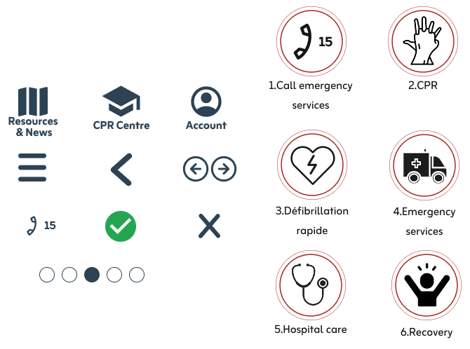
Iconography
The icons on the left provide a clear and concise visual guide for the app’s menu and sections.
- Menu icons:
- A map icon represents the “Resources & News” section.
- A student hat icon symbolizes the “CPR Centre” pages.
- A user icon stands for the “Account” page.
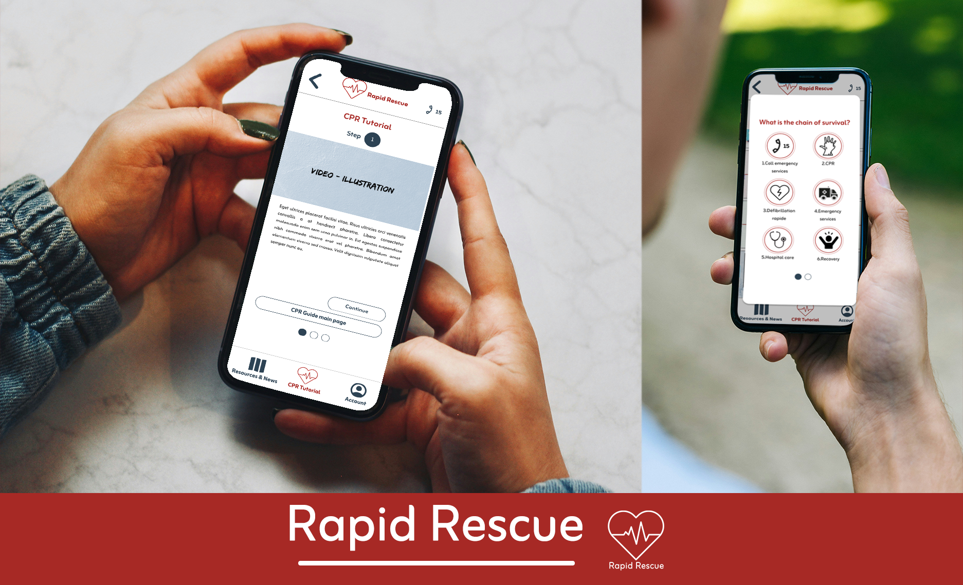
- Chain of survival icons: Each icon represents a critical component of the emergency response process, making the steps easier to remember.
- Other icons and visual symbols:
- The hamburger menu icon accesses the main navigation menu.
- Back and next arrows help users navigate through sections.
- Dots indicate the user’s current page or section, offering a visual progress guide
High-fidelity wireframes
Now is the time to talk about the high-fidelity wireframes and the final prototype. These designs reflect the culmination of my research, iterative design, and user feedback. The pages below represent the final version of the app after comprehensive testing, research, feedback and iterations.
Participants continued to find the app easy to use and follow, which was a positive affirmation of the design. However, they also suggested several improvements and identified a few issues with the app’s flow:
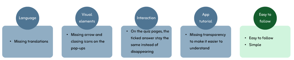
I then addressed these points to ensure that the final prototype met all user expectations. The high-fidelity wireframes and final prototype embody a user-centered approach, incorporating real user feedback to deliver an optimal experience.
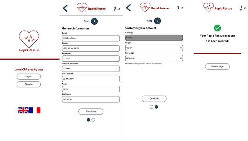
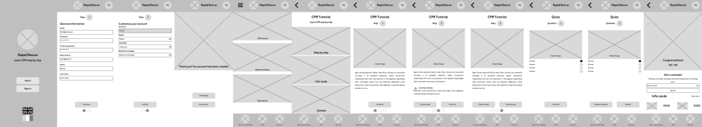
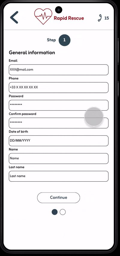
Above are the sign-up pages of the app. Users have the option to change the language and select their region for improved localisation and a more personalised experience.
Below is the user flow for the main tutorial to help users get familiar with the app:

Final app prototype
Here is the final mobile app prototype:
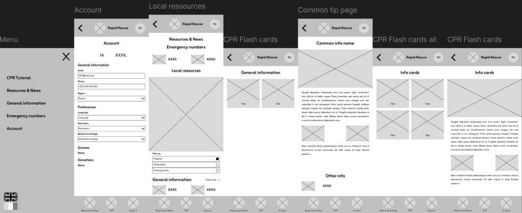
Translation
As mentioned before, Rapid Rescue is designed to be accessible in both English and French. Users can effortlessly switch languages during their initial sign-in or at any time within their profile settings, simply by selecting the appropriate flag icon.
Here are a few examples of the translated pages:
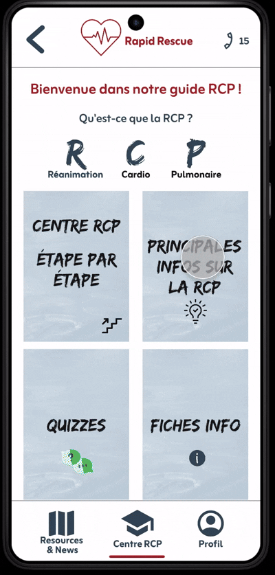
These pages represent another part of the app dedicated to all kind of useful information regarding CPR.
Conclusion
This is a mock up project but in the next phase, I will engage with other teams to gather their texts and banners, ensuring a smooth launch of the final product. Our subsequent steps include creating the website and tablet versions, as well as designing a dark mode to enhance user experience.
Moreover, I believe implementing a donation feature to facilitate users in contributing to organizations close to their hearts but that is something that would need to be discussed with other teams as well.
Expanding the app to other countries is essential to uphold the values of Rapid Rescue, which aims to empower everyone to learn CPR, regardless of their location.
For this second project, I learned that using colour, booelean and text variables from the beginning to streamline the design process and enable easier iterations in the future makes a big difference in my workflow. It’s better to spend time at the beginning to win time when designing.
