
Trailtales. A camping supplies app.
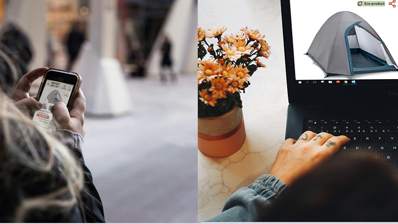
Trailtales is a mock camping gear and outdoor essentials store dedicated to inspiring and equipping adventurers. They offer a wide selection of high-quality products, from tents and sleeping bags to cooking and hiking equipment, emphasizing durability and comfort. Trailtales is also committed to sustainability, offering eco-friendly products and partnering with conscious brands. Beyond retail, they provide a convenient rental service for those who don’t want to invest in long-term gear ownership, perfect for occasional campers or trying out new equipment. Trailtales aims to be a community hub for outdoor enthusiasts, offering expert advice and promoting responsible environmental practices.
Research
Key challenges & constraints
The main challenge was creating all the content for the mock-up with no budget. To help me, I used AI to help develop the fundamental aspects of the app, which was almost like having a brief handed to me.
Competition
My research involved looking into existing apps and websites. I discovered that my key competitors are mostly national companies that sell to adults and families. They have a varied range of products, from hiking equipment to camping gear to ski and swimming outfits, like Decathlon Canada or Canadian Tire. Decathlon is renowned for its good price/value ratio with its quality own-brand products. Canadian Tire, though mostly famous for its automotive parts, also has outdoor and sporting equipment. All of the apps and websites are responsive on desktop and mobile, and they all have a comprehensive and easy-to-use menu. They also have dedicated apps. Canadian Tire is national, but Decathlon is international and has a bilingual website (French, English).
User personas
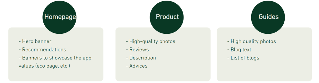
Based on my research, I created two user personas that represent the potential users of Trailtales, ensuring that their needs and preferences are well-catered to in the app design.
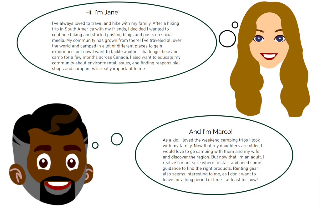
Based on the two personas, my target audience encompasses any adult looking to purchase camping supplies. They might use phones, tablets, or computers, whether they are relaxing on their couch with a laptop or browsing during their holidays on their phones.
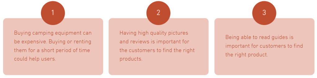
Pain points
Design
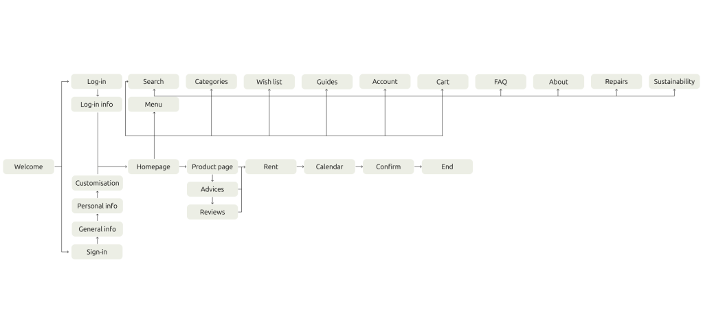
Sitemap
After finishing up my research, I proceeded to design a sitemap.
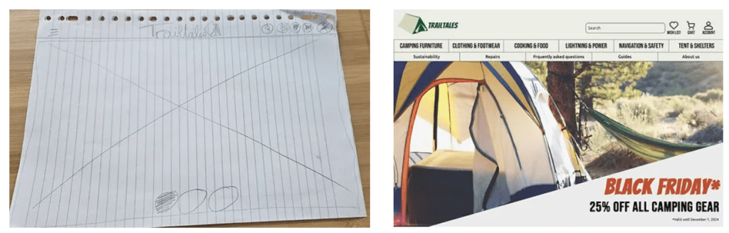
First drawings
I initiated my design process by developing paper low-fidelity wireframes that illustrated the main pages of the app, including the homepage, search page, and product description page. I began with the app version, as it is the smallest size, and followed the progressive enhancement method. This approach ensured that the app was optimized for smaller screens first, gradually adding more features and improvements for larger devices, resulting in a seamless user experience across all platforms.
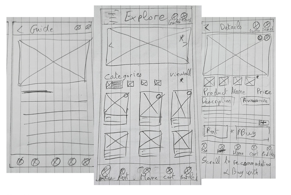
Main pages & elements
Once I had sketched out my wireframes, I transitioned to Figma to create digital low-fidelity wireframes for all the pages. This step allowed me to refine the layout and structure, ensuring a cohesive and user-friendly design across the app.
Pain points
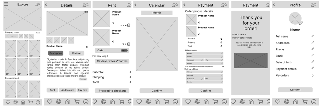
The wireframes above illustrate the basic user flow of the app, starting from the homepage, selecting a product, proceeding through the checkout process, and viewing a simple account page. Although the participants in my user study generally appreciated the app’s clarity and usability, they noted that some icons were ambiguous, and certain essential information was missing.
Switching to high-fidelity prototypes
After concluding my initial user study and identifying areas for improvement, I proceeded to design high-fidelity mockups and create the final prototype. This step allowed me to refine the visual design and functionality, ensuring the app met user expectations and provided a seamless experience.
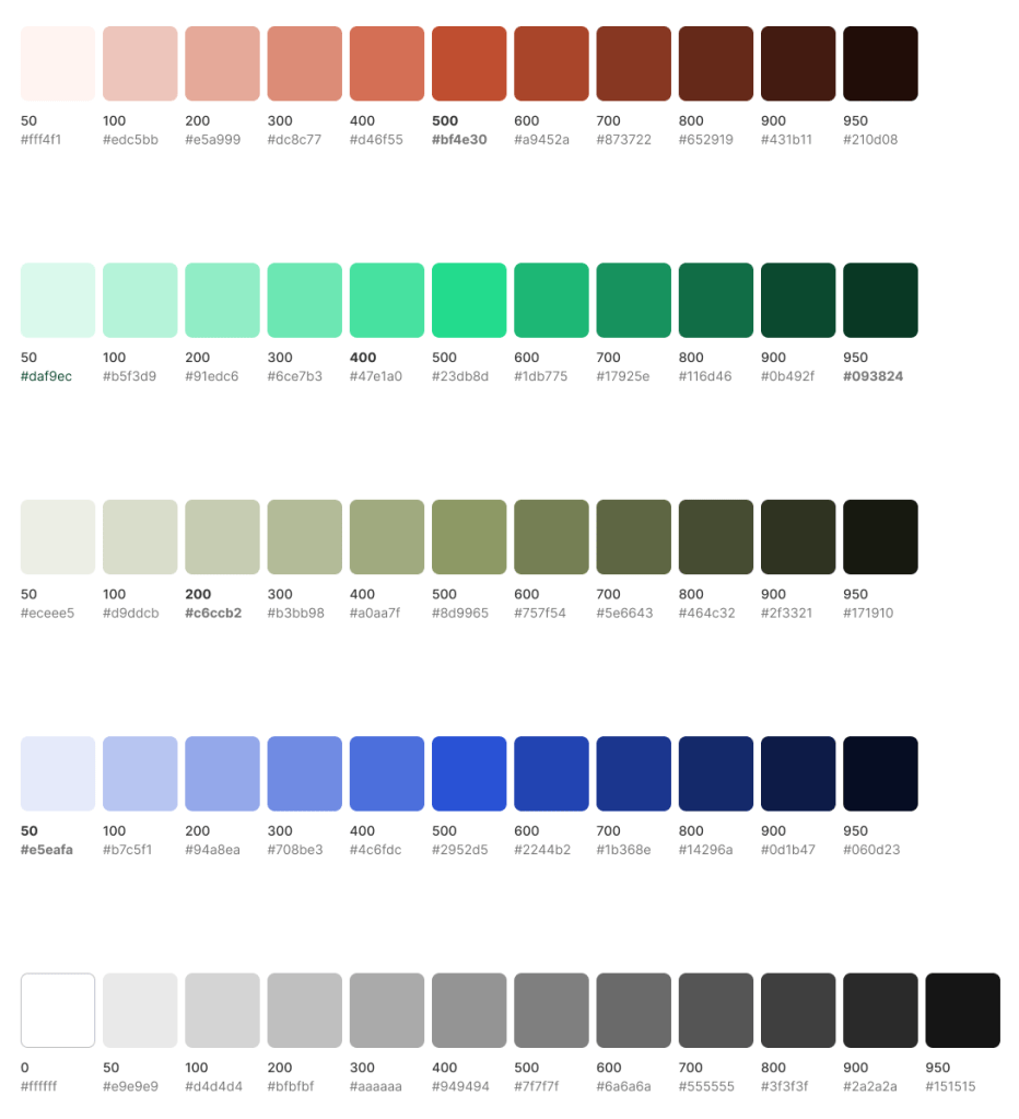
Colours
Since this is a mock project, I selected my own color scheme, opting for shades of green and red. Initially, I chose a deep green (#093824) but ultimately decided on a lighter green shade (#ECEEE5) for the bottom and top bars to create a more calming color harmony. The pressed buttons are red (#BF4E30) to signify their importance and draw user attention.
Typography
I then shifted my focus to selecting the type fonts and typefaces. For titles, I chose the bold and impactful “Bangers” font. For the main text, I opted for the clean and modern “Ubuntu Sans” font. Additionally, the icon labels were given a distinct look with the “Bebas Neue” font, ensuring a cohesive and visually appealing design.

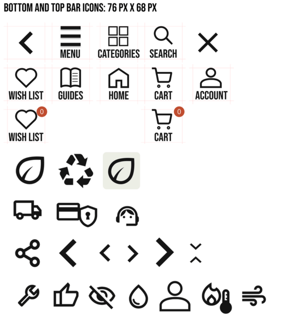
Iconography
The wish list and cart icons feature variants displaying the number of articles in the basket or saved list, allowing users to quickly see if they already have items in these spaces.
Trailtales also uses other icons that are used for example on the Sustainability page or the About page. A lot of the icons are also used on the product page to easily show the product advantages.
These icons enhance the user experience by providing visual cues and easily accessible information throughout the app.
First high-fidelity wireframes
Here is the main user flow:
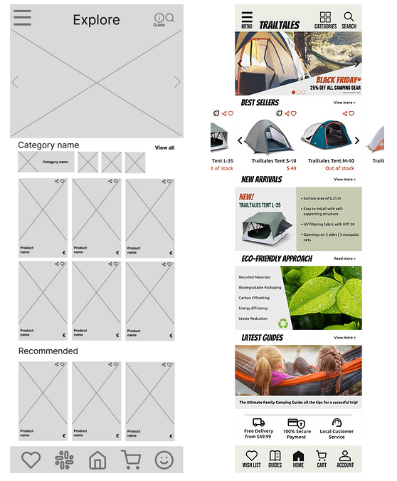
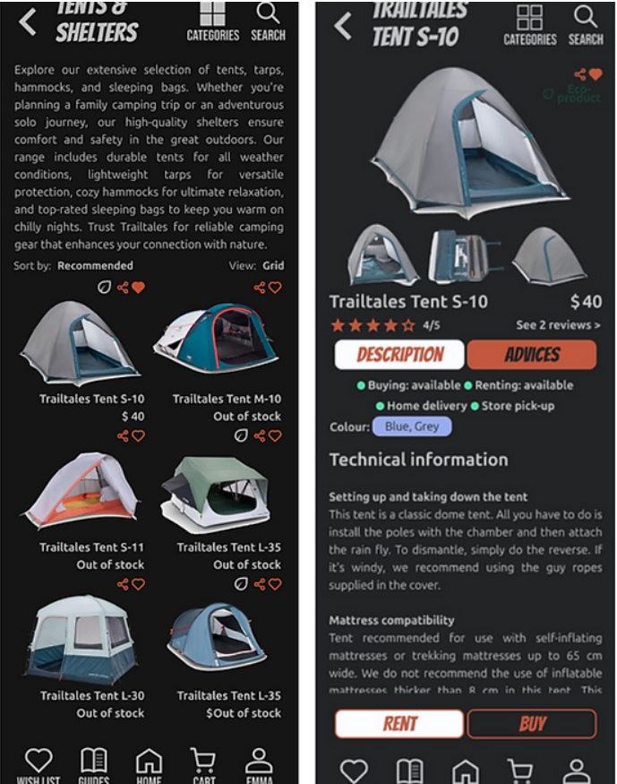
The hi-fi wireframes show pictures of the products as well as marketing banners. The hero banner and the best sellers are interactive to show more products or deals.
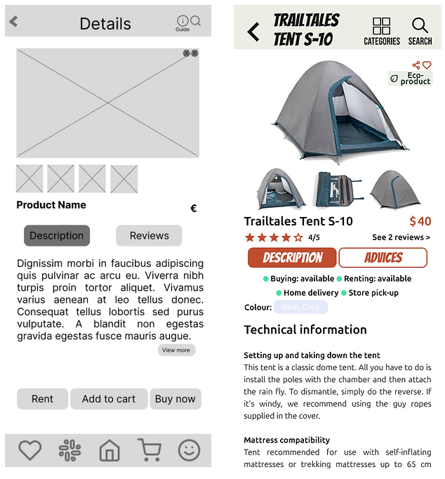
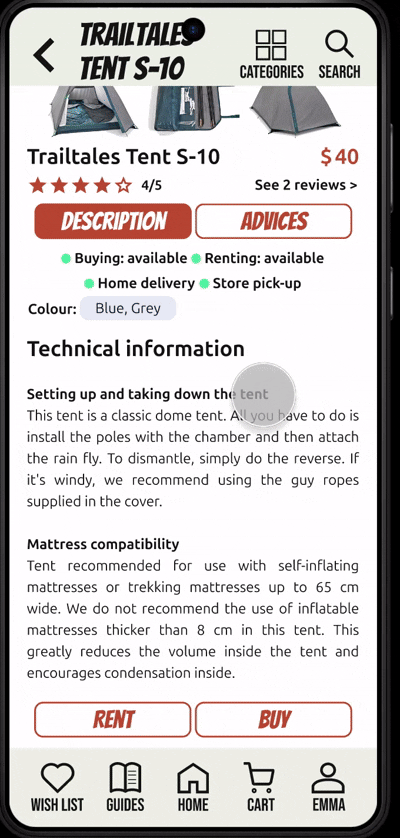
This is the main product page. It shows high-quality pictures of the product and clickable buttons for the reviews, detailed description and advices related to the tent. Users are also able to share or like the item.
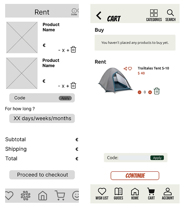
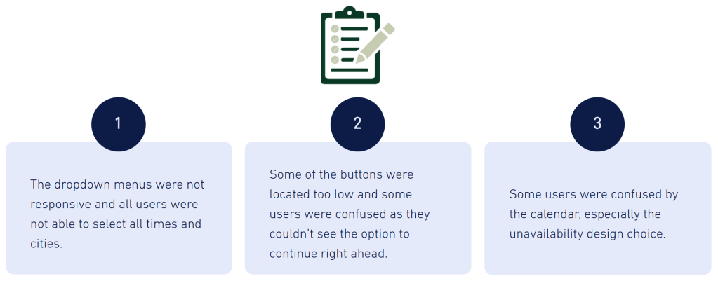
After results of my user study, I clarified the cart page to differentiate between the product bought and rented. Customers also the option to apply a promo code if they have.
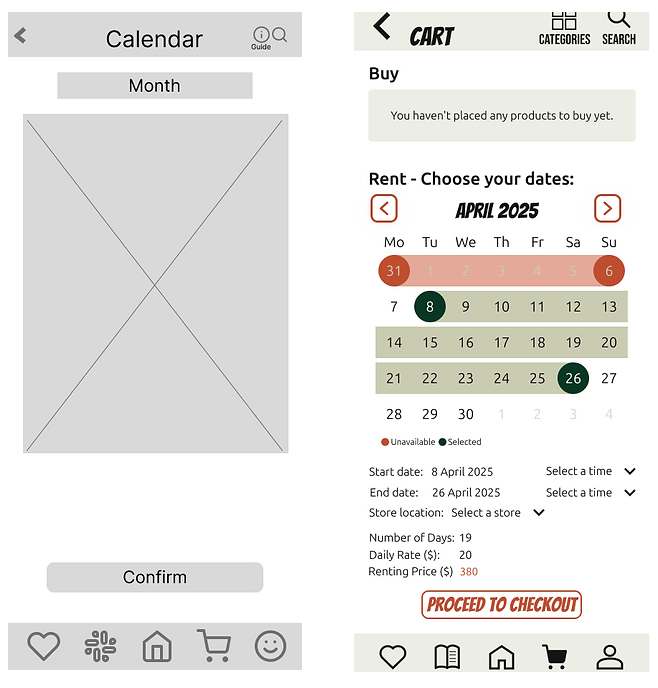
The calendar page has also been improved following my participants feedback, such as adding an unavailable range, and adding info for the start date and time of the rental, as well as the daily rate and number of days.
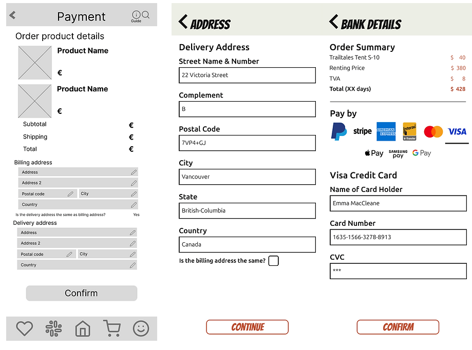
Some participants of my user study were confused by the end of the checkout process so I have split it into two, one for the address and one for the payment details.
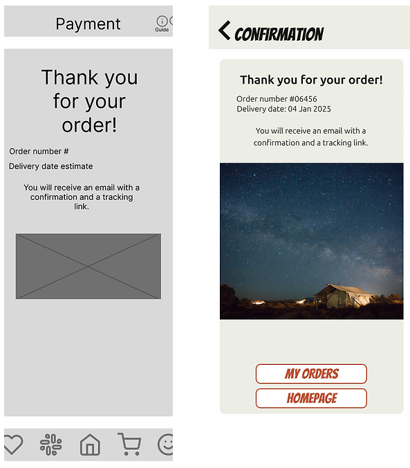
The confirmation page has been slightly simplified as well.
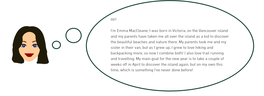
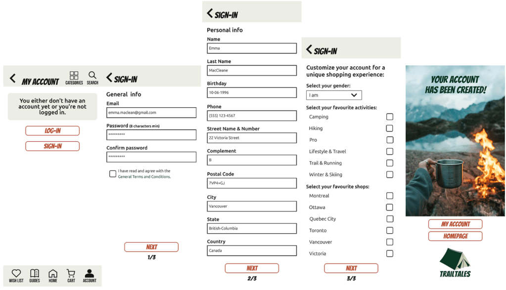
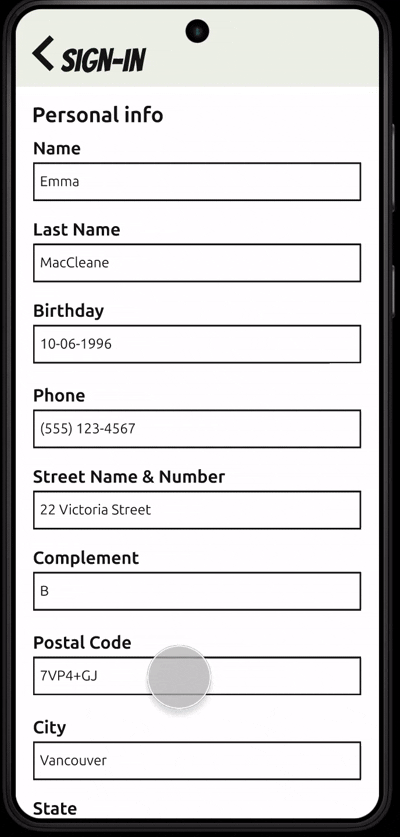
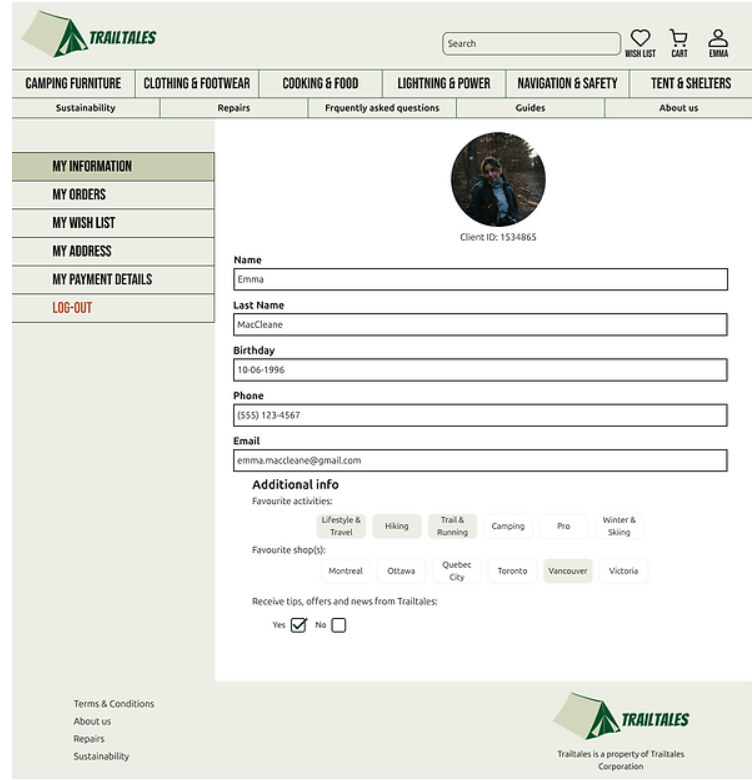
Emma
Emma is my mock user I created for this project as I also created the sign-up and account pages.
Below are the sign-up pages:
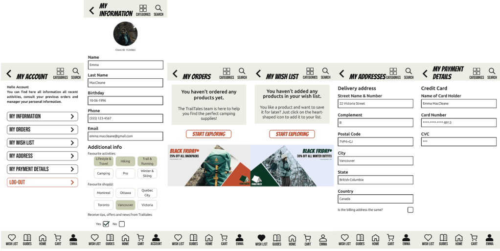
The account pages will automatically fill in with the info provided by the user during their registration. I also created all banners.
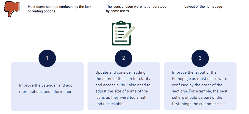
Improvements to be made before the final product
I performed a second moderated and unmoderated study to gain feedback for potential users, adults above the age of 18, some are tech-savy and some with little experience with e-commerce apps.
Final app prototype
Here is the final mobile app prototype:
From mobile to desktop and tablets
Desktops
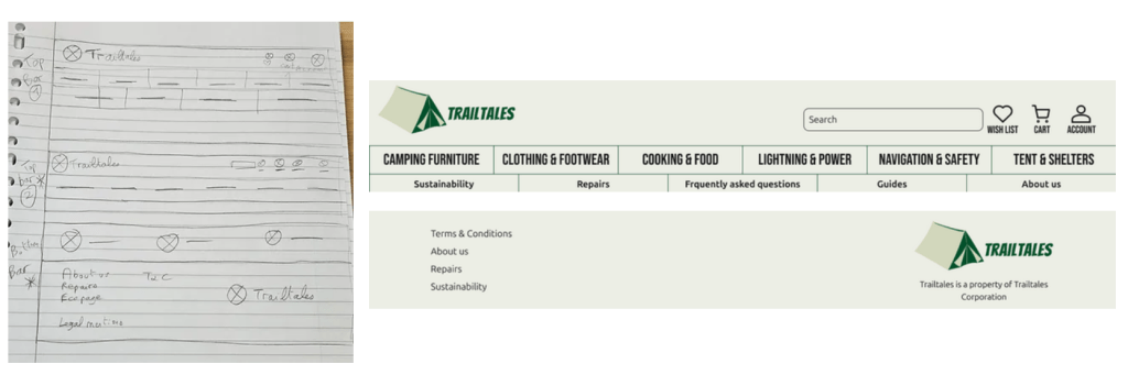
After finalising the mobile app, I started desiging and drawing for the desktop and tablet version of Trailtales.
I started by drawing the homepage used on the desktop versions.
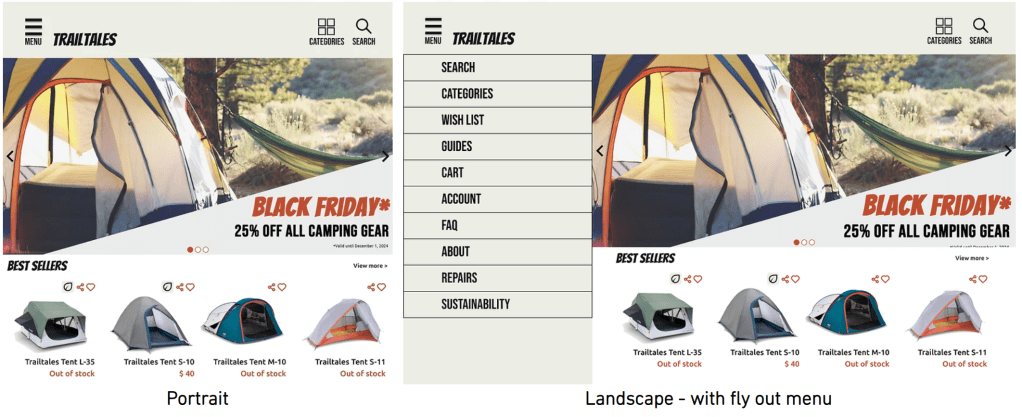
The desktop version of the homepage still contains the hamburger menu but the logo and icons locations have changed. The paper wireframe only shows what users will see above the breakpoint, which is a large hero banner showcasing the deals and new products.
Surprisingly, the biggest challenge for the desktop version was the top and bottom bars.
To follow most of the competition, I chose to add the searchc bar, all categories and the the important pages like the FAQ and guides so that users can easily access them. The bottom bar also contains important pages like the general conditions.
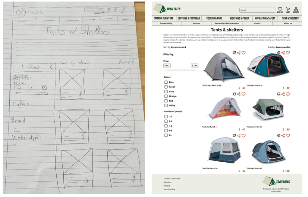
One of the other biggest changes going from mobile to desktop was the categories pages. Thanks the added space I was able to add the filters next to the product cards.
The account design also changed thanks to the added space.
Tablets
Dark mode & accessibility
I also created a dark version for people who prefer to use the dark mode or for people who prefer this contrast.
I made sure to add alt texts to all my sections so that screen readers can read out loud the sections names for people with lower vision.
Conclusion
The next steps for this project would be first to add more products to buy as only one product was active for this project. The other important thing would be to make the “buy” button available, but for time restrictions, it wasn’t clickable. The same can be said for the guides and the FAQ that need to be maintained.
I would also like to add common e-commerce parts like a subscription/club advantages or being able to log in as a guest.
I learned a lot for this first project, the first thing being to not underestimate the power and the use of the paper wireframes as they are great for multiple tries and they are quick to do.
This project also allowed me to use Figma for the first time and get accustomed with the website and options, like the variables, design tokens and prototype animations and interactions.
 Sarah Bousselet